A study commercial cover page Template is most useful when it gives a reader an immediate understanding of what the document is, who prepared it, what organization or course it belongs to, and what subject it examines. A strong cover does not need to be elaborate. It needs a clear title, disciplined spacing, readable typography, consistent branding, and enough identifying information to distinguish the report from other documents. This is especially important when a commercial study combines research findings with business analysis, because the first page establishes expectations for everything that follows.
Searches for this type of template often reflect several closely related needs. Some readers want a polished business case study cover, while others need an academic research title page, a field-study front page, or a document that can be adapted to Word, Google Docs, or PDF workflows. The underlying design principles remain similar: establish hierarchy, identify the study, show ownership, and leave enough visual space for the page to remain easy to scan. The best choice therefore depends less on decoration and more on the purpose of the study.
Template collections show a broad range of useful approaches, from restrained monochrome covers to structured corporate layouts, research-oriented title pages, and designs with strong geometric elements. The examples below illustrate how the same basic information can be arranged in very different ways without losing professional clarity.

What a commercial study cover page should accomplish
The first responsibility of a commercial study cover is identification. A reader should be able to recognize the document type and subject without opening another page. The main title should therefore receive the strongest visual emphasis, while the organization, author, client, course, department, or reporting period can occupy secondary positions. A useful cover behaves almost like a label: it identifies the document accurately without trying to summarize every finding.
The second responsibility is credibility. A professional cover signals that the report has been prepared deliberately. This does not mean that a decorative design automatically makes research more credible. In fact, excessive graphics, crowded text, inconsistent fonts, or weak contrast can make a serious study look less authoritative. A restrained layout with predictable alignment usually communicates more confidence than a page filled with competing visual elements.
The third responsibility is continuity. The visual language established on the cover should be capable of continuing into the body of the study. If the cover uses a corporate color, a particular type treatment, or a distinctive geometric motif, those choices can be reflected subtly in headings, section dividers, charts, or page elements. The cover should feel like the beginning of the report rather than an unrelated poster placed in front of it.

Core elements to include
A dependable study cover normally begins with the study title. The title should describe the subject rather than rely on vague wording such as “Business Report” or “Commercial Study.” If a subtitle is necessary, it can clarify the location, period, product, market, organization, or research question. A useful title might identify both the subject and the analytical angle, such as “Retail Expansion Study: Market Conditions and Commercial Feasibility.”
The next layer is identification information. Depending on the setting, this may include the organization, department, author, research team, client, course, instructor, project code, reporting period, or submission date. Not every document needs every field. The goal is to include information that helps a reader distinguish the report and understand its ownership. Unnecessary contact information can make a cover look crowded, while too little information can make the document difficult to identify once printed or circulated.
Branding is another useful element, particularly for commercial studies prepared for an organization. A logo can appear near the top, beside the title, or within a small header. If there is no official branding requirement, a simple typographic treatment is often enough. The cover should not become an advertisement unless the study itself is intended as a marketing asset. For an internal analytical report, clarity should normally take priority over promotional styling.

Choosing the right visual hierarchy
Visual hierarchy determines what readers notice first, second, and third. On a study cover, the title should usually dominate. The organization or course can be smaller, while the author and date can occupy a quieter position. This hierarchy can be created through size, weight, spacing, alignment, and contrast rather than through many decorative elements.
Typography deserves particular attention because a cover often contains very little text. When there are only a few words, every typographic decision becomes highly visible. A bold sans-serif heading can produce a modern commercial appearance, while a restrained serif treatment can suggest a more traditional academic report. Either approach can work if the type remains readable and the hierarchy is consistent.
Whitespace is equally important. Empty space is not wasted space on a cover; it separates information and gives the title room to breathe. A common mistake is to fill large areas simply because the page looks empty during drafting. In practice, generous margins and intentional blank areas can make a document look more sophisticated and easier to scan.

Commercial versus academic cover layouts
A commercial study usually benefits from a stronger brand presence than an academic paper. A company logo, project name, client name, or reporting period may be important because the document is part of an organizational workflow. The cover can therefore use brand colors and a more distinctive layout, provided that the design does not compete with the title or obscure essential information.
An academic cover normally emphasizes institutional identification, study title, author, course or department, instructor where applicable, and date. The precise requirements can vary by institution and style guide, so a generic template should not be presented as an official institutional requirement. A cover page template for research paper should therefore be treated as a starting structure unless the assignment specifies a particular format.
There is also a useful middle ground for studies that have both academic and commercial characteristics. A market-research project prepared for a university course, for example, may need a university name and student details while still examining a commercial question. In such cases, a restrained business-style layout with clearly organized academic identification can communicate both purposes effectively.
Designing for different document formats
A practical template should survive conversion between common document formats without losing its structure. When preparing a study commercial cover page template word file, keep text boxes, alignment, margins, and image placement simple enough that they remain stable when the document is opened in another environment. Excessively complex floating objects can create spacing problems during editing.
For a study commercial cover page template google docs workflow, simplicity becomes even more valuable. A layout based on ordinary text blocks, tables used carefully within the editing environment, and stable graphic elements is easier to maintain than a highly intricate composition. The objective is not to reproduce a designer’s artwork at any cost but to preserve the hierarchy and usability of the cover.
A study commercial cover page template pdf is best understood as a presentation-ready version of the page rather than necessarily the best format for editing. PDF is useful when visual consistency matters and the document needs to be reviewed or printed without accidental layout changes. Before distribution, inspect the final rendered page at normal viewing size and at print scale to ensure that small text remains readable.

How to structure the title and supporting information
The title should answer the simplest question: what is this study about? If the subject is broad, add a concise qualifier. For example, “Commercial Property Market Study” can become “Commercial Property Market Study: Tenant Demand and Location Assessment.” The added phrase gives readers useful context without turning the cover into an abstract or executive summary.
A subtitle is especially useful when the main title must remain short. It can identify the research period, market segment, geography, or analytical purpose. Keep the subtitle visually secondary. If the subtitle becomes as large as the title, the hierarchy becomes ambiguous and the reader has to work harder to determine the document’s central subject.
Supporting information should be grouped logically. Organization and department can form one group; author and role another; date and reporting period another. Grouping related information creates visual order even when the page contains several fields. This approach is more effective than scattering individual labels across the page.

Using examples without copying their limitations
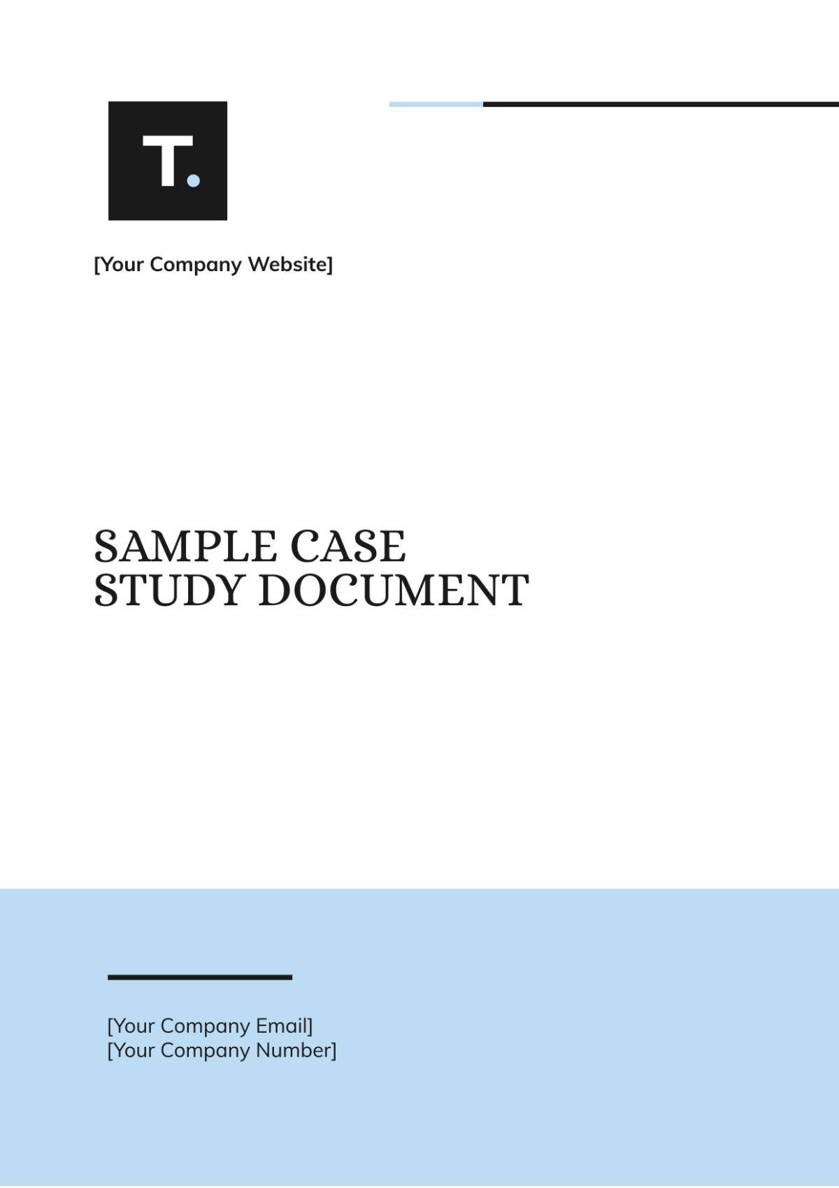
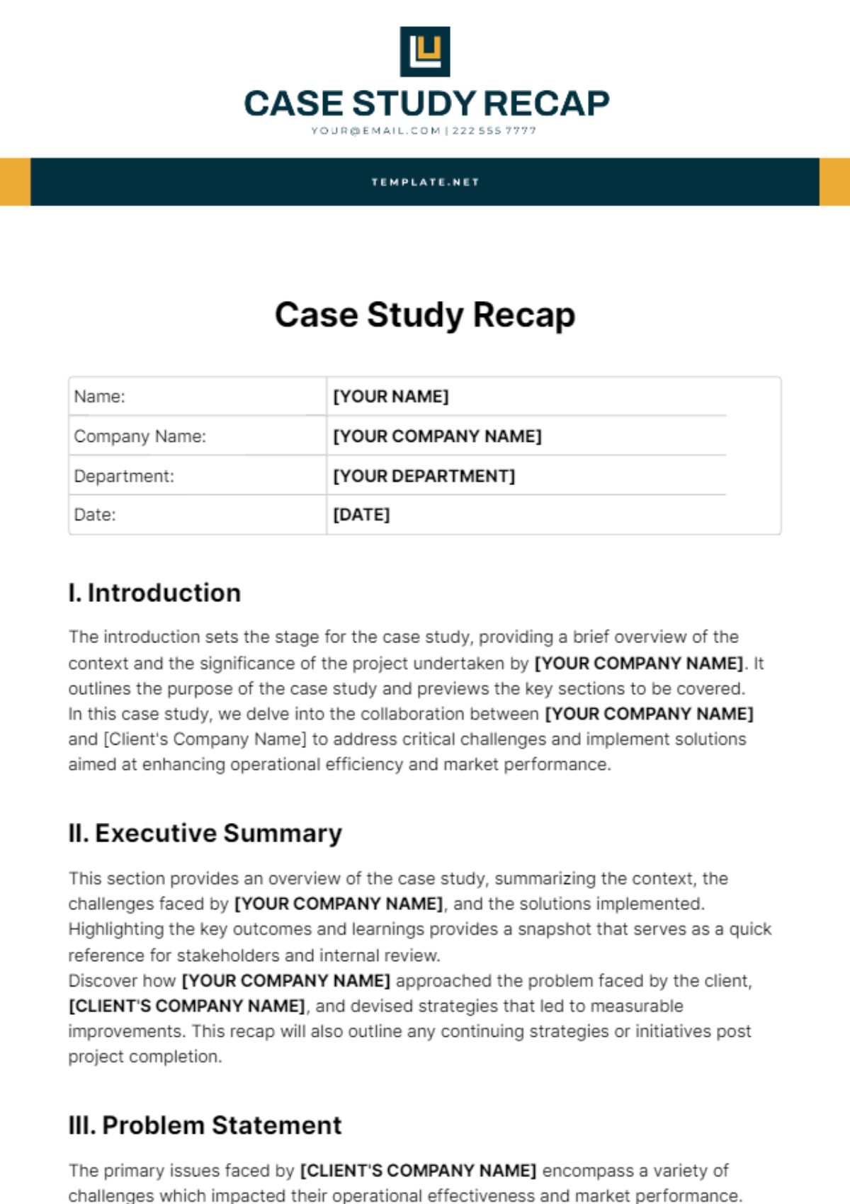
Visual examples are useful because they reveal decisions that are difficult to explain abstractly. One cover may demonstrate strong title contrast, another may show how a logo can sit above the heading, and another may illustrate how a small contact block can anchor the bottom of the page. The purpose of examining examples is to understand the design logic rather than reproduce every visual detail.
A sample cover page template can also help identify missing information. Before finalizing a cover, compare its structure against several credible examples and ask whether a reader could identify the title, organization, author, date, and document purpose immediately. If one of those answers is unclear, revise the hierarchy before worrying about decorative refinements.
The same principle applies to a case study cover page template. A case study may be written for a class, a consulting project, an internal review, or external communication. The cover should reflect the audience and purpose. A highly academic report does not need a sales-oriented design, and a client-facing business case does not necessarily need the visual conventions of a university paper.

Adapting the layout for business case studies
A business case study cover benefits from making the commercial subject unmistakable. The title can name the organization, initiative, product, market, or challenge under examination. If confidentiality matters, use an approved project identifier rather than exposing sensitive client information. A cover is often circulated separately from the full report, so it should not reveal information that was intended to remain inside the document.
The cover page of a business case study can also support a narrative structure. If the report examines a challenge, solution, implementation, and outcome, the title can emphasize the central business issue rather than merely naming the company. This helps the reader understand why the case is worth examining before reaching the methodology or results sections.
For internal business use, a restrained design often works particularly well. A strong title, modest logo, project identifier, date, and reporting group can be enough. For an external case study intended for clients or stakeholders, a more distinctive visual system may be appropriate, but the same principle remains: the cover should communicate substance before decoration.
When a field study needs a different emphasis
A field study cover page template may require information that would not normally appear on a commercial report. Depending on the project, the cover might identify the study location, observation period, research team, course, department, or fieldwork topic. The design should make those details easy to locate without allowing them to overpower the study title.
Field studies often involve a specific setting, so the cover can use a small geographic or contextual descriptor. For example, a study examining retail conditions in a particular district could include the location as a subtitle. This is more informative than using a generic heading such as “Field Study Report” because it immediately distinguishes the project.
The same approach works when commercial research is based on field observations. Keep the cover neutral about findings. The title should identify the study rather than imply a result that has not yet been established. This distinction is important because a professional report should not make conclusions appear predetermined merely through its cover language.

Building a research-oriented cover
Research-oriented covers generally work best when they separate identity from interpretation. The title names the study, while the author, institution, course, and date identify the work. A research cover should not attempt to display every variable, finding, or methodological detail. Those belong inside the report.
Research titles also benefit from specificity. Instead of a broad phrase such as “Consumer Behavior Study,” a more useful title might identify the population or context, such as “Consumer Behavior in Urban Grocery Retail: A Commercial Study of Purchase Drivers.” The exact wording should reflect the actual scope of the research rather than exaggerate it.
A visually sophisticated cover can still remain academically restrained. Geometric shapes, a limited color palette, or a small institutional mark can provide structure without turning the page into promotional material. This is especially useful when the same study must be understood by both academic reviewers and commercial stakeholders.

Common layout styles worth considering
A minimalist cover uses a plain background, a strong title, and a small information block. This style is effective when the study needs a formal appearance and when the organization’s branding is already strong. Minimalism also reduces the risk of visual clutter and usually translates well between editing and presentation formats.
A corporate geometric style uses bands, curves, lines, blocks, or angular shapes to create a recognizable visual system. It can work particularly well for commercial studies because it provides a polished identity without requiring photographs. The key is repetition: if one shape is introduced on the cover, related shapes or lines can be echoed elsewhere in the document.
A research editorial style gives more attention to institutional details and title hierarchy. It may use centered or strongly aligned text, restrained colors, and a formal information block. This style is useful when the study is primarily academic but still concerns a commercial subject.

How to choose between Word, Google Docs, PDF, and other formats
People searching for a study commercial cover page template download often have a practical need: they want to begin with an established layout instead of creating the page from scratch. Before selecting a resource, check which editing format it actually supports and whether the layout remains usable after modification. A visually impressive cover is not useful if its text cannot be changed or its alignment breaks during editing.
Someone seeking a study commercial cover page template word free resource may prioritize a familiar editing environment and easy customization. The important considerations are compatibility, editable fields, page size, font availability, and whether the design depends on assets that may disappear when the document is moved between systems. A simple structure is often more practical than a complicated design with many external dependencies.
For readers looking specifically for a study commercial cover page template free option, the same evaluation criteria apply. “Free” should not be treated as a substitute for quality control. Review the actual layout, licensing terms where relevant, editability, and suitability for the intended audience before adopting a design. The most useful resource is the one that solves the formatting problem without creating additional work.

Practical Solution
The most reliable way to build a study commercial cover is to start with content rather than decoration. Write the final study title first, then identify the organization, author or team, date, project identifier, and any required academic or client information. Remove fields that do not help identify the report. Once the information is known, arrange it into three levels: primary title, supporting context, and administrative details.
Next, choose one visual direction. For a corporate report, use a restrained brand palette and a simple logo treatment. For an academic-commercial study, use a formal title hierarchy with modest branding. For a field study, emphasize location and study period. Keep margins generous, test the title at normal reading size, and check that every important field can be understood without zooming. Then compare the page against several visual references and remove anything that does not improve clarity.
Finally, test the cover in the format in which readers will actually receive it. Check the editable version for alignment, then inspect the rendered version for page breaks, missing fonts, cropped graphics, inconsistent spacing, and weak contrast. A study commercial cover page template free download resource may provide a useful starting point, but the finished cover should always be reviewed as part of the complete report. The objective is a professional first page that accurately represents the document, not simply a visually attractive template.

A useful final check is to reduce the cover mentally to five questions: What is the study? Who prepared it? Who or what does it concern? When was it prepared? Why should the reader recognize it as a distinct document? If the page answers those questions quickly, the design is doing its job. If the reader must search around the page for basic identification, simplify the composition before adding visual effects.

Practical checks before finalizing the cover
Proofread the title more carefully than any other part of the document because an error on the cover is highly visible. Confirm organization names, dates, project identifiers, department names, and author details. Make sure capitalization is consistent and that abbreviations are understandable to the intended audience. If the report is confidential, verify that the cover does not expose restricted client information.
Check visual consistency as well. Align the logo and title deliberately, maintain consistent spacing between information groups, and avoid mixing too many typefaces. If a graphic is used, make sure it supports the study’s subject rather than functioning as unrelated decoration. A document about market analysis, for example, may benefit from abstract geometry or a restrained chart motif, while a random lifestyle photograph can distract from the analytical nature of the report.
Finally, inspect the cover alongside the second and third pages. The transition should feel natural. If the cover uses a dark background but the report suddenly switches to an unrelated visual language, the document may feel assembled from separate pieces. A small recurring color, heading treatment, line, or spacing convention can create enough continuity to make the complete study feel professionally designed.

Examples for different study purposes
A commercial market study might use a bold title, company logo, reporting period, and geographic scope. A customer case study might emphasize the client organization and project subject. A field research report might place the study location and observation dates near the title. An academic case analysis might give greater prominence to the institution, course, student, and instructor.
These differences do not require entirely different design systems. The same underlying grid can support all of them. What changes is the information hierarchy. When the audience changes, decide which details deserve prominence and which should become secondary. This makes a reusable template more adaptable and prevents every report from looking identical.
The best commercial covers also leave room for future variations. A team may eventually need a shorter report, a longer research study, a client version, or an internal version. If the original design depends on fixed decorative elements and tightly packed text, adapting it becomes difficult. A modular structure with movable title and information blocks is usually a better long-term solution.

For studies that need a more analytical appearance, a data-oriented design can be effective. A subtle graph line, grid, geometric pattern, or restrained numerical motif can reinforce the research theme. However, the actual evidence belongs inside the report. The cover should not imply a result that the study does not substantiate.

For client-facing work, a stronger visual identity can make the report easier to recognize in a collection of documents. A consistent logo position and title treatment can become part of an organization’s reporting system. This is particularly helpful when several commercial studies are issued over time and need to look related without being identical.

For student research, clarity remains the priority. A polished cover does not need to imitate a corporate brochure. A clear study title, institution, department, author, course, instructor where required, and date can be enough. When a template is adapted for coursework, always follow the actual assignment instructions if they differ from a general example.

For executive audiences, the cover should be especially easy to scan. Decision-makers often need to identify the document, subject, business unit, and reporting period immediately. Large readable typography and a concise information block generally work better than decorative complexity.

For specialized research, the same principle applies. A clinical, environmental, educational, financial, or commercial study can use a distinctive visual treatment while retaining a clear title and identification structure. The design should reflect the character of the study without pretending that visual style itself is evidence.

Reference Examples
A study commercial cover page Template can range from highly restrained academic layouts to more expressive business designs, but the strongest examples share several structural qualities. They establish the study title clearly, create a visible hierarchy between the title and supporting information, and use spacing to separate identity details from decorative elements. Some examples rely almost entirely on typography, while others use geometric forms, color fields, borders, or subtle imagery to create a distinctive identity. Comparing these approaches is useful because it shows that professional presentation does not depend on one universal visual style. Instead, the most appropriate cover is the one whose hierarchy matches the purpose, audience, and level of formality of the study.
The following visual references help illustrate how a study commercial cover page Template can be adapted for academic research, commercial analysis, fieldwork, case reporting, and formal institutional documents. Look at the placement of the title, the amount of whitespace, the treatment of logos and author details, and the balance between graphic elements and information. These comparisons can help when deciding whether a new cover should be minimalist, corporate, editorial, geometric, or research-oriented. They are best used as design references rather than as fixed rules, because the final structure should reflect the actual requirements and audience of the study being prepared.

Case Study Monochromatic Cover Page
Source: Template.net

Case Study Business Cover Page
Source: Template.net

Research Term Paper Cover Page
Source: Template.net

School Research Paper Cover Page
Source: Template.net

Creative Project Research Paper Cover Page
Source: Template.net

Research Paper Cover Page
Source: Template.net

Academic Research Paper Cover Page
Source: Template.net

Colorful Abstract Research Paper Cover Page
Source: Template.net

Research Paper Book Cover Page
Source: Template.net

Chicago-Style Research Paper Cover Page
Source: Template.net
